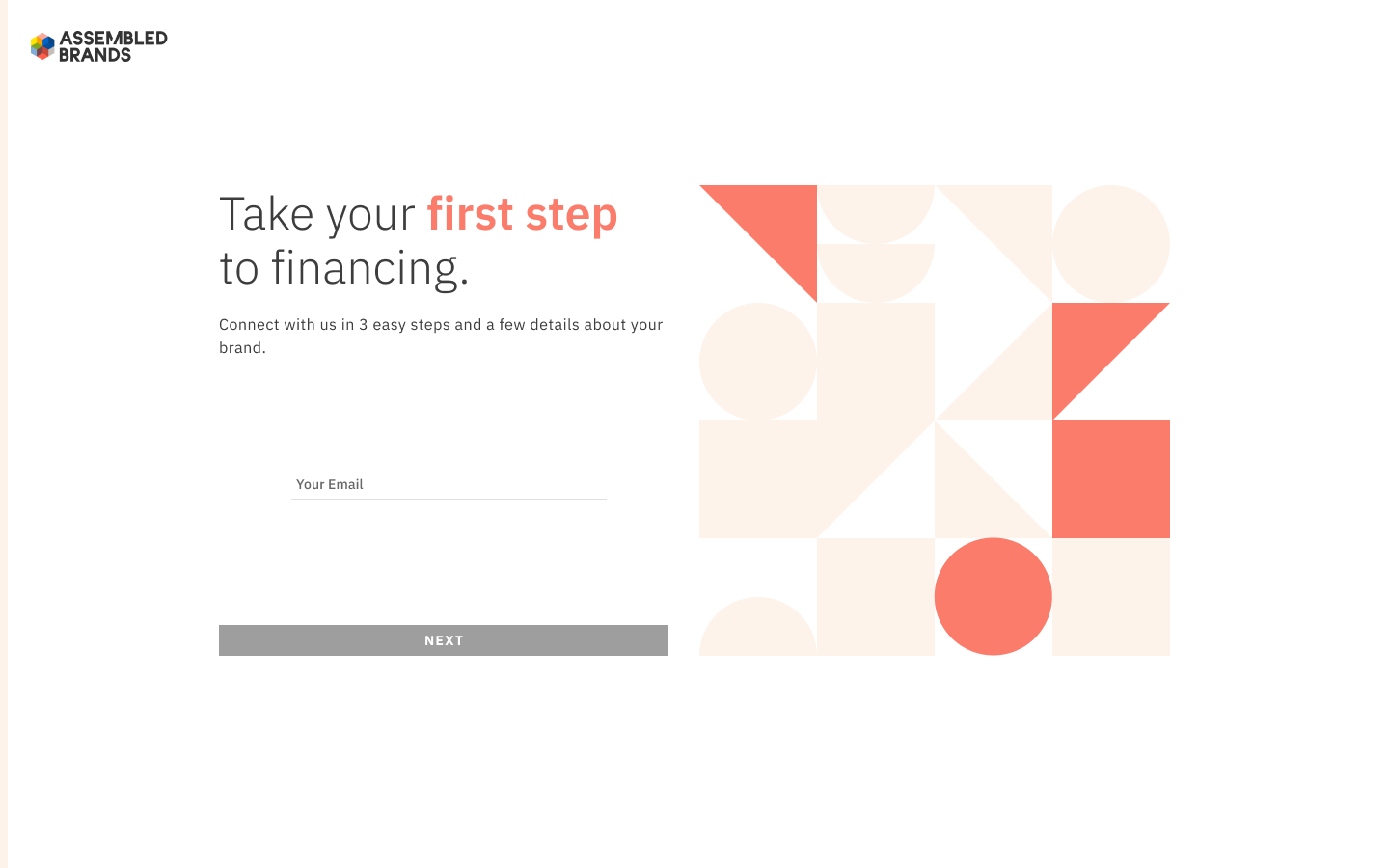
How can we redesign a stale UI, without building a new backend?
My Role:
Senior Product Designer: Discovery and analysis, UI, usability testing
Product:
Application/sign up process for businesses seeking a loan
Team:
Director of Product, Senior Software Engineer, Sales and Credit teams
Why is this in my portfolio?
The reality is UX often asked to adapt to the hard rocks of engineering and product. In this case I accomplished a lot, despite being presented with room to do very little.
Discovery
My first step was to understand the current issues with our existing application, which had been built as an MVP by external consultants. The initial problem was voiced by our leadership team, with a goal of more applications for loans, faster processing to close, and growth in our book of business.
The target user was a founder or executive of a direct-to-consumer brand who needed an alternative to rigid bank loans, or selling equity for venture capital. They’re busy juggling a variety of vendors, logistic providers, manufacturers and might not have a dedicated CFO yet. Applying for credit may be necessary, but difficult to carve out time to complete.
The first step of my discovery process was quantitative. Our application flow was not mobile responsive, yet a slim majority of applicants were using tablets and smartphones. Pages asking applicants to integrate banking and financial data had longer time on page. Times to complete applications and bounce rates were also high, suggesting the application was difficult to complete.
The next step was more qualitative. Analytic findings in hand, I had conversations with recent clients who had applied for and closed a loan. Concerns focused on integrating with Plaid and Shopify, which felt both slow and invasive. They expected a fast pre-approval with simple requirements, not a review of their banking history. The language was seen as confusing, as it was not clear what was required vs. what was optional or what next steps would be. Presentation was also confounding, as it was not clear what steps had been completed.
Furthermore, with input from our engineering team, it was clear that we did not have resources to refactor our data sources (Quickbooks, Plaid, and Shopify integrations, document uploads) or presentation of that data to our underwriters. However, I was able to verify the “pre-approval” feedback, as underwriters shared they only used a small portion of the data received in their initial review of applications.
This lead me to focus primarily on our UI as a path to resolving our UX. My plan was to work around the rigid technology, and ask less of the user while presenting key requirements more clearly.
““I just need to know if they have enough credit to justify calling them back.””
““It takes too long - I don’t have time to track this stuff down while trying to get a business off the ground.””
Existing Application
While I had some familiarity with the existing application, as a new member of the team I next needed to do a deeper dive into the problems I had discovered, and prioritize what I could focus on fixing.
The original application asked applicants creating an account, but did not offer much to come back to. While users could log in to upload additional or updated documents, the entire review, negotiation and approval process took place over the phone and via email. This felt like an opportunity to streamline the process for everyone involved.
At this stage for an applicant, the credit’s team primary goal was to assess credit worthiness of an applying business. A Quickbooks integration or a few document uploads could meet this need - but none of the other steps were marked as optional. This meant the application was not only too long and too difficult, but not providing immediate value with the slow Plaid and Shopify integrations. These helped with approval, but that process may be days or weeks away for an applicant.
At this point I met with our sales team who often referred leads to this application. They voiced concern for cold leads, who did not already have a compelling reason to work with us, and would never bother applying with such strict requirements. This group was typically ignored in favor of warmer referral leads, which would no longer be an option with our executive goals.


Redesign I: Cold Lead Flow
To work around some of our technology constraints while staying focused on our executive goals, I split the design goals into two phases. The first would be easier and faster to deploy, and address the most immediate concerns.
The phase focused on new flow specifically addressing new applications for credit. This would help users simply avoid integrations that were slow, as only a few ballpark figures were necessary to decide if an applicant should move forward. I was able to not bump into our existing backend, as we only needed to capture a few new inputs that were easy to store and retrieve.
This provided a more focused and streamlined experience that could be completed quickly by a busy applicant, or one who was unfamiliar with us and may not trust a connection to their bank account. A bonus opportunity was the realization that we could resume our paid AdWords campaigns, which performed poorly with our stricter, more complex application.
At this stage, I also pressed for broadening our brand guidelines and introduced new design language. With a strict palette of peach and black our existing application struggled to present a modern, forward-thinking brand. More colors also gave me tools to show states and imply progress, while simpler layouts emphasized streamlined instructions.
At launch, this flow immediately doubled our weekly average for application completions. Within the first week we also had our cold lead start an application that did eventually lead to a closed loan, something we had not yet accomplished.
Desktop, tablet, and mobile designs:


Redesign 2: Brand Profile
The second stage of this redesign was the more complex process of collecting data that would enable Underwriting to make their decision. This process was more open ended, as currently these steps took place manually via email.
I brought this process into an “empty dashboard”, starting applicants with only the option to connect Accounting data. As this was most important it would ensure that it was completed first. In exchange, the user would be rewarded with insights about the data they provided and be encouraged to complete additional connections. Thanks to the accounting connection and application information, our Sales team could also assess if an incomplete Brand Profile was worth following up on.
This profile has long term aspirations, as well. By establishing a two way relationship of data in exchange for insights, we start encouraging users to return and learn more. The dashboard design language would let us swap different elements in and out based on their progress, eventually allowing for the approval and negotiation process to be integrated here, as well as long term account management.


